
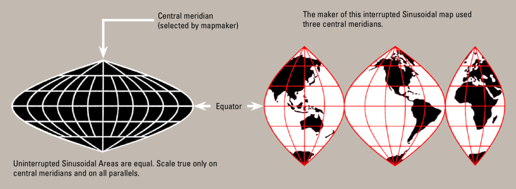
The Interrupted Sanson-Flamsteed Sinusoidal Projection is an equal-area map that uses multiple, separate sections (or lobes) for the continents. Its purpose is to show the true size of countries while minimising the severe shape distortion that usually occurs at the edges of continuous world maps. This projection is technically a composite pseudocylindrical projection whose core property is achieved by ensuring that the scale along all parallels (lines of latitude) is true.
Nomenclature and history
The history of the Sinusoidal Projection, before it was “interrupted,” can be traced back to the 16th century, making it the oldest pseudocylindrical projection still in use.
Early Origins (16th Century): The earliest recorded use of the Sinusoidal projection on a world map was by the French hydrographer Jean Cossin of Dieppe in 1570. It was also used by other cartographers, such as Jodocus Hondius, in the early 17th century for maps of equatorial regions, including South America and Africa.
Sinusoidal
The projection is named “Sinusoidal” because of the curved shape of its lines of longitude (meridians), which mathematically follow the path of a sine wave. This curvature is necessary because the map must preserve the area of all features. Since lines of latitude become shorter as you move away from the equator on a real globe, the meridians must squeeze inward in a wave-like fashion to accurately represent the decreasing width of the Earth at higher latitudes.
Sanson-Flamsteed
The “Sanson-Flamsteed” attribution comes from two influential figures who were key in popularising the projection for different purposes:
John Flamsteed (English, late 17th Century): As the first Astronomer Royal, Flamsteed adopted the projection for his highly accurate celestial maps and his famous Atlas Coelestis (published posthumously in 1729), demonstrating its usefulness outside of terrestrial geography.
Nicolas Sanson (French, 1650s): A renowned royal geographer, Sanson used this projection extensively in his major atlases for mapping continents, primarily because its equal-area property was excellent for showing the true size of colonies and land holdings.
The Interrupted Feature
The term “Interrupted” means the map of the world is not drawn as one continuous piece; instead, it is deliberately cut into several separate sections, or “lobes,” like flattening an orange peel.
The idea of using the map in an “interrupted” form came much later, primarily to address the severe shape distortion that plagued the original projection near the edges and poles. This technique of segmenting the map into lobes (as seen in your canvas file) was famously employed and popularized by cartographer J. Paul Goode in the early 20th century, notably in his Goode Homolosine Projection (which combines the Sinusoidal and Mollweide projections). The interrupted method became the standard for most modern thematic world maps.
The Result: The resulting map, like the one plotted in your canvas, consists of multiple lobes (the Americas, Africa/Eurasia, and Asia/Pacific), each individually projected to minimise shape distortion over the land. The gaps are strategically placed over the oceans where the distortion is less problematic.
The Problem: The standard Sanson-Flamsteed (Sinusoidal) projection is excellent at showing the correct area of every country (an equal-area map). However, areas far away from the central vertical line (the central meridian) become increasingly stretched and severely distorted in shape. This distortion is worse near the far left and right edges, especially near the poles.
The Solution: By creating an interruption (a break or gap), you can re-centre the projection for different sections of the globe. You draw a new central meridian ($\lambda_0$) for each major continent or landmass. This moves the zones of least distortion (the straight, central line) over the areas you care about most (the land).